Pharmacy website design in Missouri has to work for a parent in a Kansas City suburb, a student in Columbia, and a retiree in an Ozarks county on a weak signal. RevealSite builds custom websites for independent pharmacies, and this guide covers what a modern Missouri build should include and how to judge one.
Your website is where many patients decide whether to call. According to Statista, mobile devices generated 62.54% of global website traffic in Q4 2024, so the phone screen is your real storefront. Independents make up 35% of US retail pharmacies, per the NCPA 2024 Digest. A clear, fast site gives yours a way to stand out online.
Below, you'll see what separates a modern site from a dated one, how one site can serve both big metros and rural counties, how to build safer forms, and what a sensible launch looks like.
What Does Modern Pharmacy Website Design in Missouri Actually Include?
A modern pharmacy website loads fast on phones, shows accurate hours and services for each location, and offers refill, transfer, and contact forms that respect patient privacy. It also puts the domain and content in your name, so you can change providers without losing your work.
Most owners know their site feels old. Fewer can say why. The gap usually comes down to six traits, and a quick side-by-side shows where yours stands.
Trait
Dated site
Modern site
Phone experience
Desktop layout squeezed onto a small screen
Built for thumbs first, with tap-to-call and large buttons
Speed
Heavy images and unused plugins
Compressed images, lean code, solid Core Web Vitals
Forms
An emailed PDF or an open comment box
Short refill and transfer forms with a privacy notice
Locations
One generic contact page
A page per store with hours, map, and services
Local proof
Stock photos and no reviews
Real pharmacist photos and visible patient reviews
Ownership
Vendor holds the domain and hosting
Domain, hosting, and content sit in your name
No single trait fixes a site. Together they decide whether a visitor finds what they need in a few seconds. The pharmacy website features checklist lists the specific tools worth asking for.
How Should One Site Serve Missouri's Metros, College Towns, and Rural Counties?
Give every location its own page, then tailor each page to how nearby patients actually search. Metro stores need neighborhood clarity, college-town stores need clear hours and transfer steps, and rural stores need phone-first layouts that load on a weak signal.
For rural patients, hours and a phone number must load on any signal.
One template can handle all of it if the content changes by place. Here's how the state tends to split:
Kansas City area. The metro crosses the Missouri and Kansas line, so name nearby communities on both sides and don't imply you serve only one state. Check which services you may offer to which patients before listing them.
St. Louis area. Dense suburbs put several pharmacies within a few minutes of each other. Your store page should say what sets you apart, such as delivery, medication sync, or compounding. Patients near the river may also compare Illinois pharmacies, so see the Illinois pharmacy website design guide for the other side of that commute.
Springfield, Columbia, and Jefferson City. Students, faculty, and state employees arrive in waves. A simple three-step "transfer your prescriptions" page and clear hours around semester breaks save your front counter many calls.
Ozarks, Bootheel, and northern counties. Signals are weaker and drives are longer. Keep pages light, put the phone number at the top, and show your delivery area plainly.
Multi-store groups should add one more rule: build each location page from the same template but fill it with that store's own details. Patients notice when a page for Springfield reads like a copy of the one for St. Louis, and so do search engines.
How Fast and Mobile-Friendly Does a Pharmacy Website Need to Be?
Fast enough that a patient on a phone sees your number, hours, and refill button within a few seconds. Speed isn't polish. It decides whether the visit happens at all, because slow pages lose people before they read a single word of your offer.
Phones start at a disadvantage. HubSpot reports that web pages load 70.9% slower on mobile devices than on desktop. Speed also pays back. In a case study on web.dev, Vodafone improved Largest Contentful Paint by 31% and saw 8% more sales on the optimized pages. A telecom isn't a pharmacy, but the lesson carries over: faster pages convert better.
Start with the fixes that cost the least:
Compress and resize every image before upload, especially team and storefront photos.
Remove unused plugins and widgets. Each one adds weight and a possible security gap.
Place the phone number and refill button at the top of every page.
Use readable type and large tap targets so older patients can use the site without zooming.
Test on a mid-range phone over a cellular connection, not office WiFi.
How Do You Build HIPAA-Aware Refill and Transfer Forms?
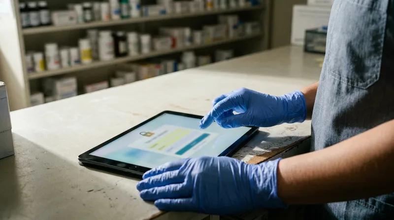
Collect only what you need to start the request: name, phone number, preferred pickup time, and a prescription number if required. Keep the form on a secure page, add a privacy notice, and send submissions to a protected inbox or system instead of a shared email thread.
Short forms that collect less are easier to secure and easier to finish.
Forms are where privacy mistakes hide. An open contact box invites patients to type conditions and medication lists. Analytics scripts and tracking pixels can also send data to third parties from pages where health details are entered. Review what runs on those pages with your developer and a qualified privacy advisor. The HIPAA-compliant pharmacy website guide covers secure intake in more detail, and the pharmacy conversion tracking guide shows how to count form submissions without exposing patient details.
What Does a Safer Form Look Like?
Short and labeled. Five fields or fewer, with plain wording.
A visible privacy notice next to the submit button.
A neutral confirmation message that doesn't repeat health details on screen.
Spam protection that doesn't require patients to solve puzzles.
A staff routine for responding the same business day.
Which Pages and Features Convert Pharmacy Patients?
Location pages, a clear services list, refill and transfer pages, a pharmacist profile, and a short FAQ do most of the converting. Each should carry one obvious action, usually call, transfer, or book, so patients don't wonder what to do next.
Local details deserve extra care. According to Backlinko, 42% of local searchers click a result inside the Google Maps Pack. Your website's name, address, phone number, and hours should match your Google Business Profile exactly, so search tools see one consistent business.
Think of each page as an answer to one patient question. Where are you? Are you open? Can you fill this? Can I switch to you? A page that answers one question clearly beats a crowded page that half-answers five. Keep paragraphs short, use plain headings, and put the action button where a thumb can reach it.
A practical page list for a Missouri independent:
Home. Phone number, hours, refill button, and one sentence on what makes you different.
Location pages. One per store, with map, hours, parking notes, and nearby communities served.
Services. Immunizations, medication sync, compounding, delivery, and any clinical services you offer.
Refill and transfer. Short forms plus a plain explanation of what happens next.
About and team. Real photos and a short bio of your pharmacist.
FAQ. Answers to questions patients ask at the counter.
Should You Build a Custom Pharmacy Website or Use a Template?
Choose custom when you need location pages, secure forms, and ownership you control. Choose a template only when your needs are simple and your budget is tight. Templates can launch quickly, but they often limit the forms, speed, and structure that pharmacy sites depend on.
Sketching location pages and forms first keeps a custom build on target.
Both paths can work. The question is which limits you can live with. A one-location store with a basic need may be fine on a template for a while. A two- or three-store group, or a pharmacy planning to grow clinical services, usually outgrows one fast. The custom vs. Wix or Squarespace comparison lays out the tradeoffs, and how much a pharmacy website costs explains where the money goes.
Whichever route you take, ask every provider these questions:
Who owns the domain, hosting, and content? The answer should be you.
How do location pages work? Ask to see an example with several stores.
How are forms secured and routed? Listen for specifics, not buzzwords.
What does ongoing support include? Updates, backups, and security monitoring matter.
Can I speak with an independent pharmacy you've built for?
Spend about a month preparing before design starts: gather hours, services, photos, and form workflows, then build, test on real phones, and launch with redirects from old pages. A clear checklist prevents most launch-week surprises and protects the rankings you already have.
Week 1: List every page, hour, phone number, and service for each location.
Week 2: Collect photos, write your pharmacist bio, and decide who handles each form.
Week 3: Review the draft on phones and test every form, link, and phone button.
Week 4: Set redirects, confirm Google profiles match, launch, and watch calls for two weeks.
Good pharmacy website design in Missouri comes down to clarity: the right facts, on a fast page, with one easy next step. Get those right and every other marketing channel works harder.
Build Your Missouri Pharmacy Website With RevealSite
RevealSite designs fast, mobile-first websites for independent pharmacies, with location pages and forms built for patient privacy.
How much does pharmacy website design in Missouri cost?▼
Cost depends on the number of locations, custom features, forms, and ongoing support, so no flat price fits every store. Ask for a written scope that lists one-time and monthly fees separately, then compare proposals line by line before you decide.
How long does a pharmacy website project take?▼
Timelines vary with site size, content readiness, and how quickly your team approves drafts. Gathering hours, services, photos, and form workflows before design starts usually prevents delays. Ask any provider for a dated schedule instead of an open-ended estimate.
Do I need a separate page for each Missouri pharmacy location?▼
Yes. Each store needs its own page with hours, address, phone number, map, and services so patients and Google can tell locations apart. Keep those details identical to your Google Business Profile, since mismatches can weaken local rankings.
Can a pharmacy website form be HIPAA-aware?▼
Forms can be designed with privacy in mind: collect minimal details, use a secure page, add a privacy notice, and route submissions to a protected system. Requirements depend on how you handle data, so review your setup with a qualified privacy advisor.
Should a rural Missouri pharmacy invest in a new website?▼
Often yes, especially if your current site loads slowly or hides your phone number. Rural patients frequently search on weak connections, so a light page with hours, delivery areas, and a refill button can matter more than elaborate design.
What should I own when a pharmacy website design in Missouri project ends?▼
You should own your domain name, hosting account, design files, and content. Ask for this in writing before signing. Without it, switching providers later can mean rebuilding from scratch or paying to recover your own pages.