Modern Pharmacy Website Design for Illinois Independents
RevealSite Team
October 6, 2026 · 11 min read
Key Takeaways
✓Design around patient tasks, since 88% of healthcare appointments are scheduled by phone, according to Invoca, which makes tap-to-call a primary conversion.
✓Give each service and each store its own page, because 81% of independents offered medication therapy management in 2024, per the NCPA Digest.
✓Write in plain language and translate refill, transfer, and hours pages first for the languages your patients speak.
✓Keep refill and transfer forms short, encrypted, and covered by a business associate agreement, and have counsel review every tracking tool.
✓Add Pharmacy structured data and FAQ content, because Pew found users click a traditional result on just 8% of visits when an AI summary appears.
✓
Build the presence your community trusts
Let us be your first step. Get in touch with our team today.
Test your own site on a phone this week and fix the three steps that block patients most before paying for a redesign.
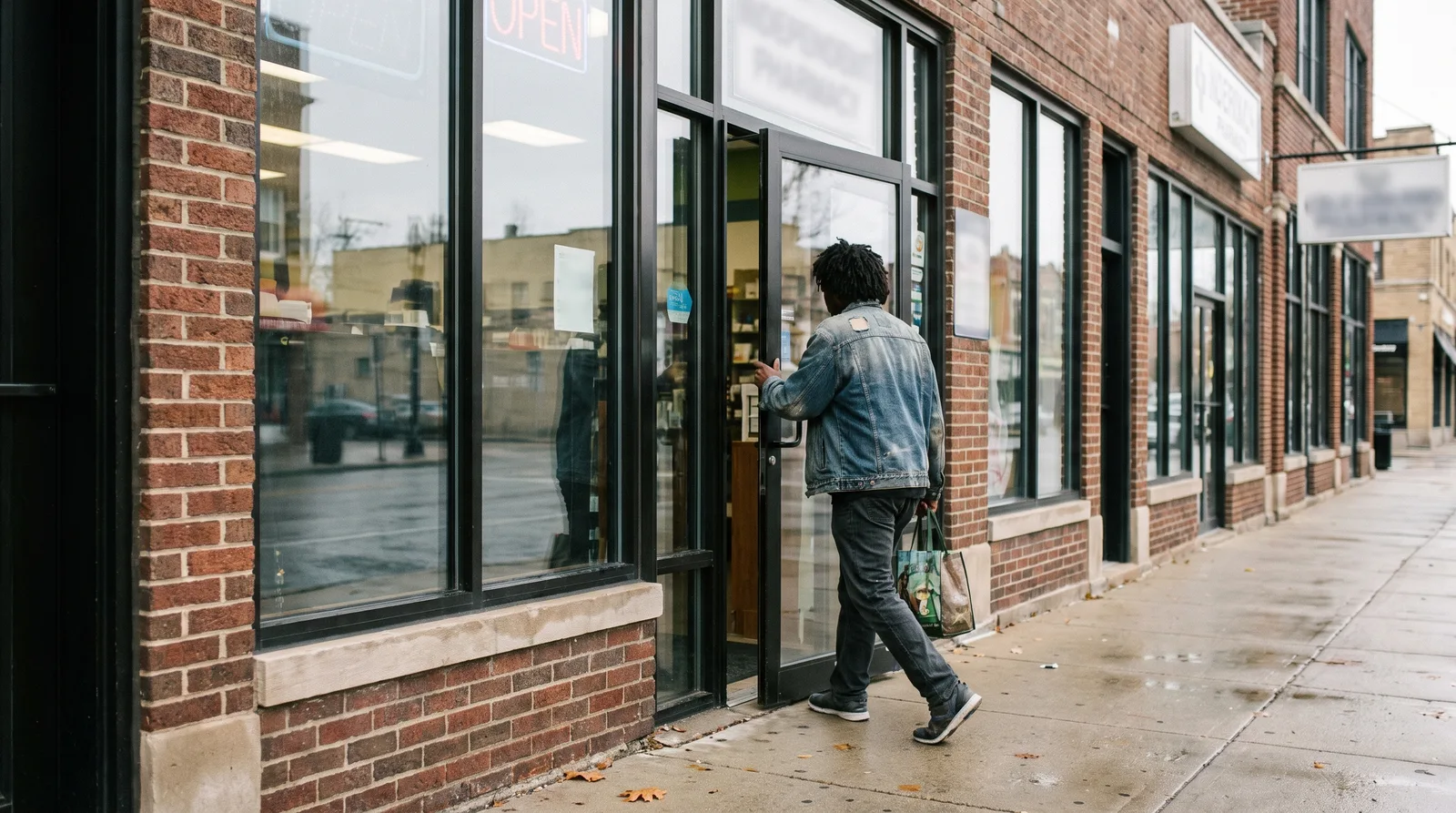
Pharmacy website design for Illinois independents starts with one question: what does a neighbor need to do in the next thirty seconds? Refill, transfer, call, or find the door. RevealSite builds sites for independent and compounding pharmacies, so this guide is organized around those tasks, not around templates.
The pressure to get it right is rising. A 2025 Pew Research Center analysis found that when Google shows an AI summary, users click a traditional result on just 8% of visits, compared with 15% when no summary appears. Fewer clicks mean your site has to earn the ones it gets, and it has to answer questions on sight.
Below, you'll find the page structure, language and accessibility choices, form privacy basics, search setup, cost drivers, and a short list for choosing a partner.
What Does Modern Pharmacy Website Design for Illinois Independents Look Like?
A modern pharmacy website centers on patient tasks: it loads fast on a phone, puts refill, transfer, call, and directions within one tap, and keeps every store's details identical to its Google profile. Looks matter less than whether a stressed caller can finish the job.
A rider with one free thumb should finish a refill request in seconds.
Think in jobs, not pages. The table pairs five common patient jobs with what the site needs and a quick test you can run today.
Patient job
What the site needs
Quick test
Refill a prescription
A prominent button that opens a short, secure form
Can you reach the form in two taps on your phone?
Transfer prescriptions
A dedicated page with a plain-language, minimal form
Does it ask for anything you don't need on day one?
Reach the pharmacist
A tap-to-call number in the header and footer
Does the number dial when you tap it?
Find the store
Address, map link, and separate pharmacy and store hours
Do the hours match your Google profile today?
Learn about a service
One page per service, such as immunizations or delivery
Can a visitor tell who is eligible and how to book?
According to Invoca's 2024 healthcare marketing statistics, 88% of healthcare appointments are scheduled by phone. For a pharmacy, that makes a tap-to-call button a primary conversion, not a footer afterthought.
Picture a Chicago patient waiting on a train platform who needs your hours, and a Decatur caregiver on rural broadband who needs to transfer a parent's prescriptions. Same site, two very different connections. Design for the weakest connection your patients have. Then check your analytics to see how many visitors use phones versus computers, and put most of your testing effort on the device most of them use.
Which Pages Should an Illinois Pharmacy Website Include?
An Illinois pharmacy website needs a home page, refill and transfer pages, one page per service, a page for each store, a pharmacist team page, and a contact page. Each page should answer one patient question clearly and link to the next step.
Services deserve their own pages because independents are doing more than dispensing. The NCPA 2024 Digest found that 81% of independent pharmacy respondents offered medication therapy management in 2024. An AMCP Foundation survey in the Journal of Managed Care & Specialty Pharmacy found that 52% of pharmacies operating a lab offer point-of-care testing. A single line in a menu can't carry that.
Immunizations are the clearest example. CDC data show pharmacies and drug stores were the top setting for adult flu shots (48.0%) and updated COVID-19 vaccinations (71.5%) in the 2023-2024 season. Say who can be vaccinated and when, and note that availability and minimum age depend on state law and pharmacist authority.
A Build Order That Works
Refill and transfer pages, since they drive daily revenue.
A location page for every store, with its own hours, map, and phone number.
Your three most requested services, each with eligibility and booking steps.
Pharmacist bios with real names and credentials, ideally with a short intro video from
How Should Your Site Serve Chicago's Many Languages and Downstate Patients?
Serve both by writing in plain language, offering key pages in the languages your patients speak, and building for older eyes and slower connections. Accessibility and clarity help every visitor, from a bilingual Chicago family to a downstate caregiver on a basic phone plan.
Translate refill, transfer, and hours pages first, and have a fluent team member review medication terms.
Use body text of at least 16 pixels, strong color contrast, and buttons big enough for a thumb.
Label every form field in words, not just placeholder text, so screen readers can announce it.
Add captions or transcripts to video, including
Ask the Pharmacist clips.
Compress images so pages load on weak rural connections.
Imagine a store in Pilsen serving Spanish-speaking families and another in Mattoon serving retirees. Their sites share a structure but not a voice. One may need bilingual buttons, the other larger type and fewer steps. Plain language also means short sentences and no jargon without a quick explanation, such as medication synchronization, which simply means one pickup date for all your refills.
Accessibility also carries legal weight. Ask your attorney how the Americans with Disabilities Act applies to your website, and run a free accessibility audit in your browser before launch. Big difference.
How Do You Build Refill and Transfer Forms That Protect Privacy?
Build them short, secure, and honest: ask only for what a pharmacist needs to start the task, send data over an encrypted connection, and tell patients what happens next. A form that collects less is easier to complete and carries less privacy risk.
Short forms and angled screens keep patient details where they belong.
Collect the basics for a transfer, such as name, date of birth, phone, and current pharmacy. Save clinical details for the phone call.
Keep prescription numbers and medication names out of page addresses and confirmation emails.
Show a plain confirmation that says when someone will call back.
Add a line telling patients to phone for urgent needs.
Store submissions only in a system covered by a business associate agreement.
Analytics deserve caution too. A pixel or chat widget on a refill page may send visitor data to an ad platform. Have counsel review what each tool collects before it goes live. Illinois also has a strict biometric privacy law, so confirm that no identity check or chat feature captures face or voice data without proper consent.
Test every form on a real phone with a weak connection before launch, and submit a dummy request to confirm someone actually receives it.
Speed matters on these pages as well. The guide to mobile-first pharmacy websites covers load times and tap targets in detail.
How Does Your Website Help Google and AI Answers Find Your Pharmacy?
Your website gives Google and AI tools clear facts to quote: store details, services, hours, and answers to common questions, marked up so machines can read them. Consistent facts across site and profile make you easier to match with nearby searches.
The same Pew analysis found that 58% of US adults ran at least one Google search that produced an AI summary in March 2025. If those summaries pull from pages like yours, clear structure becomes a visibility tool. Update structured data whenever hours change, including holiday schedules.
Give each store its own page, with its own services and staff.
Write FAQ sections as questions patients actually ask, such as whether you deliver or give flu shots.
Keep your name, address, and phone number identical everywhere they appear.
Show recent reviews on the site. BrightLocal's 2024 survey found that 75% of consumers regularly read online reviews.
Border towns need extra care. Patients in the Metro East or the Quad Cities may search from Missouri or Iowa, so name the communities you serve on each location page. For the wider local search picture, read the Illinois pharmacy marketing agency guide.
Want your site and Google profile built together?
RevealSite builds HIPAA-aware pharmacy websites and tunes your Google Business Profile as one project, so every store page matches what patients see in map results.
What Does Pharmacy Website Design for Illinois Cost, and Is a Template Enough?
Cost depends on how much custom design, integration, and ongoing management you need. A template is enough for a simple single-store brochure, but most independents with several services, refill workflows, and local SEO goals get more from a build tied to marketing.
Option
Fits
Trade-off
DIY builder
A single store with simple needs
Limited control over speed, forms, and local search structure
Custom-built site
Multi-service or multi-location pharmacies
Larger up-front investment and a need for a capable partner
Managed site with marketing
Owners who want site, listing, reviews, and ads working together
Ongoing monthly fee
Four things move the price: the number of locations, custom forms, connections to your pharmacy system or refill app, and ongoing support. Ask for each in writing. Don't forget the quiet costs, such as hosting, security updates, and who pays for content edits.
A phased build is a sensible middle path. Launch refill, transfer, and store pages first, then add service pages and content over the next quarter. You get a working site sooner, and you learn what patients actually tap before you spend more.
How Do You Pick a Website Partner and Know the Site Is Working?
Pick a partner who has built pharmacy sites, handles patient data carefully, and lets you own your domain and hosting. Then judge the site by six numbers: refill requests, transfer requests, tap-to-call clicks, direction requests, mobile speed, and form completion.
Three numbers each month tell you whether the site is working.
Step 1: Choose the Partner
Ask these five questions, and listen closely to the answers.
Which pharmacy sites have you built? Ask to open them live on your phone.
Who owns the domain, hosting, and content? The answer should be you.
How do your forms handle patient information? Listen for encryption, minimal fields, and a business associate agreement.
What will you report each month? Expect the numbers below, not page views.
What happens if we part ways? You should keep the site, the logins, and the content.
Walk away from a partner who keeps your logins, promises a rankings jump, or can't explain where form data goes.
Step 2: Track Six Numbers
Record this month's numbers before launch so you have a baseline. Then review the table on the schedule shown.
What to track
Where to find it
What it tells you
How often
Refill requests
Your form tool or analytics
Whether the most common task works
Weekly
Transfer requests
Form submissions, matched to completed transfers in your pharmacy system
How many new patients the site brings in
Weekly
Tap-to-call clicks
Call tracking or click events
How many visitors choose the phone
Weekly
Direction requests
Google Business Profile insights
How many visitors plan a trip to your door
Monthly
Mobile page speed
Google Search Console or PageSpeed Insights
Whether the site loads quickly on phones
Monthly
Form completion rate
Form submissions divided by visits to the form page
Where patients give up
Monthly
One caution: a form submission isn't a patient yet. Match transfer requests to completed transfers in your pharmacy system, so you know how many became real patients.
Benchmarks help set expectations. Chili Piper's 2025 form conversion report found small and mid-market companies convert visitors to leads at 1.4%, about double the 0.7% enterprise rate. Your pharmacy numbers will differ, but watching your own rate each month shows whether a change helped.
What Should You Fix on Your Pharmacy Website This Week?
Open your site on a phone and complete a refill request, a transfer, and a call. Note every extra tap, slow load, or unclear label, then fix the three that block patients most. Small fixes to those paths usually matter more than a full redesign.
That's the heart of pharmacy website design for Illinois independents: the site earns its keep when a neighbor finishes a task in under a minute. A Chicago storefront and a downstate county-seat store need different words but the same discipline.
Run the test, write down what you find, and bring the list to your next conversation with a designer or an agency.
How long does pharmacy website design for Illinois independents take?▼
A focused build with refill, transfer, service, and location pages often takes several weeks, depending on how many stores you have and how fast you supply content. Ask your designer for a written schedule with dates for design approval, content, testing, and launch.
Does an Illinois pharmacy website need to be HIPAA compliant?▼
A site that collects patient information through forms should follow HIPAA safeguards. Use encrypted transmission, collect only what you need, and store submissions with vendors who sign a business associate agreement. Ask your attorney to review your setup, since requirements depend on how the site is used.
Should a pharmacy website have a page for each location?▼
Yes. Each store needs its own page with its own address, phone number, hours, services, and map. Separate pages help patients find the right counter and give Google clear signals for each store, instead of one blended page that fits no neighborhood.
Can I offer my pharmacy website in Spanish or Polish?▼
Yes, and in many Chicago neighborhoods it can help. Translate the refill, transfer, and hours pages first. Ask a fluent member of your team to review every medication term, and keep the layout identical across languages so patients can find the same buttons.
How often should a pharmacy update its website?▼
Review hours, services, and staff details monthly, and update immediately when anything changes, such as holiday hours or a new vaccine. Stale details send patients to a closed counter and can conflict with your Google profile, which hurts trust and local search visibility.
Is a pharmacy chat widget or text feature safe to add?▼
It can be, with care. Confirm what data the tool collects, where it stores messages, and whether it signs a business associate agreement. Collect text consent before sending refill reminders, and avoid features that capture face or voice data without proper consent.