Independent Pharmacy Website Design in Ohio (2027 Guide)
RevealSite Team
October 5, 2026 · 9 min read
Key Takeaways
✓Build every page around one patient task, such as a refill, a transfer, a call, or directions.
✓Put speed first on phones, since mobile devices generated 62.54% of global web traffic in Q4 2024, per Statista.
✓Use secure, purpose-built forms and keep prescription details out of general contact boxes and email.
✓Match your website to your Google Business Profile, because 42% of local searchers click a Maps pack result, according to Backlinko.
✓Ask who owns your domain, hosting, and accounts before you sign with any web design partner.
✓Track online refill and transfer requests, tap-to-call clicks, and mobile speed instead of page views alone.
Independent pharmacy website design in Ohio starts with a simple fact: your site is often the first stop for a patient deciding where to fill the next prescription. builds websites only for independent and compounding pharmacies, so this guide sticks to what moves refills, transfers, and phone calls.
Build the presence your community trusts
Let us be your first step. Get in touch with our team today.
Independents make up 35% of US retail pharmacies, per the NCPA 2024 Digest, yet many still run sites built years ago. A slow page, a buried refill button, or a confusing form can send a transfer to the chain down the road. You'll never see that lost patient. That's the problem.
Below, you'll see what strong design includes, which pages matter, how speed and privacy shape the build, and how to pick a partner.
What Does Good Independent Pharmacy Website Design in Ohio Look Like?
Good pharmacy website design makes the next step obvious: refill, transfer, call, or get directions within seconds on a phone. It loads quickly, explains your services plainly, and handles patient information carefully. Polished visuals matter far less than moving a patient from search result to action.
Think of your site as a digital counter. A patient arrives wanting one thing, and if the refill link hides in a menu, they leave. Picture a Columbus commuter checking hours at lunch, a Toledo caregiver comparing delivery options, or a rural-county patient on a weak cell signal. Each needs the answer fast.
Plenty of sites get in their own way. Auto-playing videos, rotating banners that hide key information, and generic stock photos all slow patients down. A real photo of your pharmacist and a plain list of services does more work than any slider.
Three Jobs Every Pharmacy Homepage Should Do
Show your hours, phone number, and address without scrolling.
Offer clear buttons for refills and transfers.
Explain the services you offer, such as immunizations, delivery, compounding, and medication synchronization.
If your homepage does only these three things well, it's already ahead of most.
Which Pages and Features Should an Ohio Pharmacy Website Include?
At minimum, an Ohio pharmacy website needs a homepage, service pages, a refill page, a transfer page, a contact and location page, and an about page that introduces your pharmacists. Each page should have one clear job and a visible next step for the patient.
Page or feature
Job it does
Common mistake
Refill page
Lets patients request a refill in under a minute
A link buried three clicks deep
Transfer page
Walks new patients through moving prescriptions
Asking for too much information up front
Services pages
Explains immunizations, delivery, compounding, and clinical services
One crowded page for everything
Hours and location
Answers "are you open" and directions questions
Hours that don't match your Google profile
Pharmacist bios
Builds trust before a patient ever visits
Stock photos instead of your real team
A separate guide to the pages every pharmacy website needs goes deeper on each item. Start with the refill and transfer pages. They're where patients either complete a task or give up.
Want a site built around refills and transfers?
RevealSite designs pharmacy websites with clear refill paths, fast mobile pages, and privacy-aware forms, then tunes them for local search.
Why Does Mobile Speed Matter So Much for a Pharmacy Website?
Most visitors reach your site on a phone, and slow mobile pages lose them before they can refill or call. Google also ranks sites by their mobile version first, so a clunky phone experience hurts your visibility as well as your conversions.
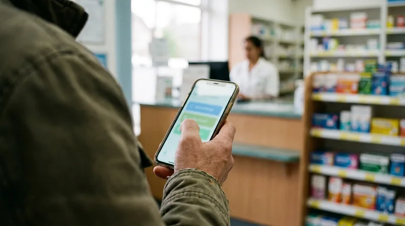
Most patients meet your pharmacy on a phone first, so every second counts.
Statista reports that mobile devices generated 62.54% of global website traffic in Q4 2024. HubSpot found that pages load 70.9% slower on mobile than on desktop. And Google now uses the mobile version of your content for indexing and ranking, per its Search Central documentation.
Speed pays off in other industries too. When Vodafone improved Largest Contentful Paint by 31%, it saw 8% more sales on the optimized pages, according to web.dev case studies. Pharmacy results will differ. The direction is the same.
Responsiveness counts as well as load time. Per web.dev, 34.5% of websites rate as poor on Interaction to Next Paint, which replaced First Input Delay as a Core Web Vital on March 12, 2024. In plain terms, a page that freezes when someone taps your refill button feels broken, even if it loaded quickly.
Speed Fixes That Help Right Away
Compress images before you upload them.
Remove chat widgets and pop-ups that slow the first screen.
Make refill and call buttons large enough to tap with a thumb.
Choose hosting that stays quick during your busiest hours.
How Should Your Website Handle Refills, Transfers, and Patient Privacy?
Use secure, purpose-built forms that collect only what a pharmacist needs, and keep prescription details out of ordinary contact forms and email. Treat every page that touches refills or transfers as privacy-sensitive, and review any tracking tools on those pages with your attorney.
Many pharmacy sites use one general contact form for everything. Patients then type medication names into a box that was never meant for protected health information. That's a risk you can design away.
Ask for the minimum: name, date of birth, and a callback number are often enough to start.
Serve every page over HTTPS and test your forms after each update.
Tell patients not to enter prescription details in free-text boxes.
Collect clear consent before you send refill reminders by text.
Review ad pixels and analytics tags on refill and transfer pages with counsel.
Phones matter too. According to Invoca's healthcare marketing statistics, 88% of healthcare appointments are scheduled by phone, so a tap-to-call button belongs on every page. This section is general education, not legal advice. Ask your attorney and the Ohio Board of Pharmacy about state-specific rules.
Get a pharmacy website that protects patients
RevealSite builds HIPAA-aware pharmacy websites with secure refill and transfer paths, so Ohio patients can act without friction.
How Does Your Pharmacy Website Support Local SEO Across Ohio?
Your website supports local SEO by confirming what your Google Business Profile claims: the same name, address, phone number, hours, and services. Clear location and service pages then give Google solid reasons to show your pharmacy when nearby patients search.
When your site and Google profile agree, a search turns into a visit.
Backlinko reports that 42% of local searchers click a result in the Maps pack, and 76% of people who run a near me search visit a related business within a day. Per Semrush, citing SOCi data, listings in the local 3-pack get 126% more traffic than positions 4 through 10.
Your site has to back up that listing. Mismatched hours or an old phone number can cost you the very click the map earned.
Local Signals to Build Into the Site
Match your name, address, and phone number to your Google profile exactly.
Add pharmacy schema so search engines can read your hours and services.
Build one page per real service, not near-duplicate pages for every Ohio city.
Embed a map and add driving directions for patients arriving from nearby towns.
Border searches deserve a glance. Pharmacies near Toledo or Cincinnati may draw patients searching from Michigan, Kentucky, or Indiana, so check your analytics before assuming everyone is local.
Related: RevealSite also covers the wider picture of reviews, ads, and local visibility in its Ohio agency guide. Ohio Pharmacy Marketing Agency Guide →
How Much Does an Ohio Pharmacy Website Cost, and Is a Template Enough?
Cost depends on whether you choose a template builder, a semi-custom build, or a fully custom site with ongoing management. Templates cost less up front but limit refill, transfer, and privacy features, while custom builds cost more and fit how your pharmacy actually works.
Watch for costs that sit outside the quote. Professional photography, written content for each service page, ongoing security updates, and a plan for edits when your hours or staff change all affect the real total. A cheap build that needs rescuing in a year isn't cheap.
Whatever you choose, get these in writing: who owns the site and domain, who handles updates, what hosting and security cover, and what happens if you leave.
How Do You Choose a Web Design Partner and Measure Results?
Choose a partner that builds only for pharmacies, shows live examples, explains how it handles patient data, and reports on refills, transfers, and calls. Record your current numbers first, so you can judge results against a real baseline instead of a promise.
Sketching pages together shows how a partner thinks before anything gets built.
Picture a two-pharmacist store that takes most transfer requests by phone and has no idea how many it misses after closing. An online transfer form with a simple tracking report would show the volume within a month. That baseline is worth having before any redesign starts.
Questions to Ask Before You Sign
Do you build only for pharmacies, and can I see live sites?
How do your forms protect patient information?
Who owns my domain, hosting, and Google accounts?
How fast do your sites load on a phone?
What will my monthly report show?
The Metrics Worth Tracking
Refill requests and transfer requests submitted online
Tap-to-call and direction clicks
Mobile load speed and bounce rate
Calls and visits that come from Google listings
Watch for red flags too. Walk away from anyone who guarantees rankings, keeps control of your accounts, or can't explain how your forms handle patient information.
What Should You Do First to Improve Your Pharmacy Website?
Start with a quick audit on your own phone: load your site, try to request a refill, and tap to call. Whatever feels slow or confusing is your first fix, and finding it costs nothing.
Strong independent pharmacy website design in Ohio comes down to one test. Can a patient finish a task in under a minute? Fix that before you chase extras.
Here's a simple first month:
Week one: test your refill, transfer, and call paths on a phone, and write down every snag.
Week two: correct your hours, services, and contact details so they match your Google profile.
Week three: compare two or three pharmacy-focused partners and ask the questions above.
Week four: choose a plan, set your baseline numbers, and agree on a launch date.
Ready for a pharmacy website that works as hard as you do?
See how RevealSite designs fast, privacy-aware websites that help Ohio independents win more refills, transfers, and calls.
How long does independent pharmacy website design in Ohio take?▼
A template site can launch in a few weeks, while a custom build with refill and transfer forms often takes a couple of months. Timelines depend on content, approvals, and integrations, so ask any designer for a written schedule with milestones.
Does an Ohio pharmacy website need online refill and transfer forms?▼
Yes, because patients expect to act without waiting on hold. Use secure, purpose-built forms that collect only what your pharmacist needs, and keep prescription details out of general contact boxes. Ask your attorney to review how the forms store and send data.
Is a Wix or Squarespace site good enough for an independent pharmacy?▼
It can work for a simple online presence, but builders often limit secure forms, speed tuning, and pharmacy-specific features. If refills, transfers, and local search drive your growth, compare a custom or managed site before you decide.
How do I know if my pharmacy website is too slow on mobile?▼
Load it on your own phone using cellular data, then try to request a refill. If the first screen lags or buttons are hard to tap, patients feel it too. Google's free speed tools can confirm what you see.
Should my Ohio pharmacy website have a page for every city I serve?▼
Only if you truly serve each area with distinct details. Near-duplicate city pages add little value and can look thin to search engines. Build strong pages for real services and one clear location page instead.
How often should an Ohio pharmacy update its website?▼
Review hours, services, and staff every quarter, and update immediately when holiday hours or phone numbers change. Fresh details keep your site consistent with your Google profile, which protects both patient trust and local search performance.