Independent Pharmacy Website Design in North Carolina
RevealSite Team
October 11, 2026 · 10 min read
Key Takeaways
✓Put refills, transfers, and a call button within one tap of your homepage on every phone screen.
✓Test on a mid-range phone over cellular data, since Google uses the mobile version of your site for indexing and ranking.
✓Earn map pack visibility, where 3-pack businesses get 126% more traffic and 93% more calls, clicks, and directions than positions 4 through 10.
✓Keep forms short and privacy-aware, and track form completions, calls, and direction requests every month.
✓Choose a partner that builds for independents, hands you account ownership, and reports calls and refill requests after launch.
Independent pharmacy website design in North Carolina has one job: turn a phone search into a refill request, a transfer, or a call. Patients in Charlotte, Wilmington, and Boone all start the same way, with a thumb and a question. RevealSite builds that experience through its , with sites made only for independents.
Build the presence your community trusts
Let us be your first step. Get in touch with our team today.
This guide covers what a strong site includes, how North Carolina's markets change your priorities, and which features earn their place. You'll also see how to judge speed, privacy, and a design partner before you commit.
What Does Strong Independent Pharmacy Website Design in North Carolina Include?
A strong pharmacy website loads quickly on phones, explains your services in plain language, makes refills and transfers easy, and shows hours, location, and a phone number on every page. Everything else supports those four jobs.
Function matters more than decoration. A beautiful homepage that hides the refill button loses the patient to the next search result.
A refill and transfer path reachable in one tap from the homepage.
Service pages for vaccines, compounding, delivery, and medication synchronization.
Click-to-call and directions buttons that stay visible on mobile screens.
Pharmacist profiles that show the people behind the counter.
Pharmacy and LocalBusiness schema, so search engines read your details correctly.
Clinical services deserve real space. NCPA's 2024 Digest reports that 81% of independent respondents offered medication therapy management, and a patient can't book a service they can't find on your site.
Picture the first ten seconds. A parent with a sick child at 7 p.m. wants your hours, a phone number, and a quick sense of whether you stock what they need. If the site makes them hunt, they call somewhere else.
That said, a site is never finished. Hours change, staff change, and services come and go. Plan for updates from day one.
How Does Your Market Shape the Way a North Carolina Pharmacy Website Should Work?
Your market decides what visitors need first. Metro patients want speed and online refills, rural patients often browse on weaker connections, and coastal or college-town visitors need transfer help and accurate seasonal hours. Design for your real visitors, not an average one.
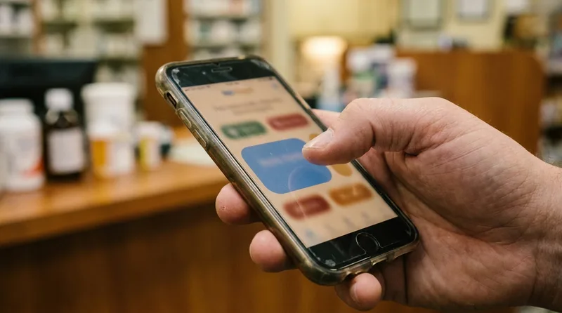
Most patients meet your pharmacy on a phone before they ever walk in.
Distance plays a different role for pharmacies than for most businesses. The Journal of the American Pharmacists Association found that 88.9% of Americans live within five miles of a pharmacy, so your site has to show why yours is worth the drive.
Visitor
What they need first
Design response
Metro commuter
Fast refill requests and pickup timing
A prominent refill button, pickup-time notes, and text updates
Rural patient on a weak signal
A page that loads before patience runs out
Compressed images, lean pages, and one-tap calling
Coastal visitor or college student
Transfer help and current hours
A short transfer form, a seasonal hours banner, and a clear map
Caregiver for an older adult
Delivery and synchronization details
Plain-language service pages, readable type, and easy contact
Seasonal swings matter as well. Coastal and mountain towns see visitors arrive in summer and fall, and many need help moving a prescription. A homepage notice that explains how to transfer in a couple of minutes does more than a generic welcome message.
Weather deserves a line in the design brief, too. After a storm, patients check your site before they call, so a banner showing hours, closures, and delivery status should be editable in minutes, not days.
Which Pages and Features Does a North Carolina Pharmacy Website Need?
A North Carolina pharmacy website needs a clear homepage, service pages, a refill and transfer page, a location and hours page, pharmacist profiles, and a reviews section. Add a blog only when you can keep it current.
Build the pages in this order:
Homepage. Put refill, transfer, call, and directions within the first screen.
Services. Give each service patients search for its own page.
Refill and transfer. Use short forms with privacy-aware handling.
Locations and hours. Create one page per store with a map and holiday hours.
About and pharmacists. Add names, photos, and the services each person leads.
Reviews and resources. Show recent Google reviews and short patient guides.
Reviews deserve their place on the page. In BrightLocal's 2025 survey, 85% of consumers turned to Google for local business reviews, so a live reviews feed on your site echoes what they already saw.
Resist pages you can't maintain. An outdated blog or a dead promotions page signals neglect. Fewer pages, kept current, beat a sprawling site that no one updates.
RevealSite builds quick pharmacy websites with privacy-aware forms and pairs them with local search work, so a patient down the road can reach you in a few taps.
How Fast and Mobile-Friendly Does the Site Need to Be?
Fast enough that nothing feels stuck when a patient taps. Google now judges your pages by their mobile layout before desktop, so a sluggish phone experience can cost you local visibility and refill requests.
Large tap targets and quick loading turn a search into a refill request.
That shift is settled. Google's documentation on mobile-first indexing explains that Google uses the mobile version of a site's content for indexing and ranking. Your phone layout is now the version that counts.
Responsiveness gets measured, too. web.dev places 34.5% of sites in the "poor" bucket for INP, short for Interaction to Next Paint, the responsiveness metric that took over from FID in March 2024. A laggy tap on "refill" is exactly what that score measures.
Images deserve special attention. A storefront hero photo can weigh several megabytes if nobody resizes it. Ask your designer to set upload limits, so staff can add seasonal photos without slowing the site.
Practical fixes are mostly unglamorous:
Compress images and serve modern formats.
Limit chat widgets, pop-ups, and third-party scripts.
Use large tap targets for refill and call buttons.
Try the site on a mid-range phone using mobile data instead of your office network.
How Should the Site Handle Refills, Transfers, and Patient Privacy?
Keep forms short, collect only what you need, and avoid putting health details where they aren't protected. A HIPAA-aware setup limits personal health information in forms, emails, analytics, and ad tracking.
Form performance is worth watching. Chili Piper's 2025 benchmark report puts small and mid-market conversion at 1.4% of visitors, so even a small gain from a shorter form adds up over a year.
Don't bury the phone number either. Invoca's healthcare research found that 88% of appointments get booked by calling, and pharmacy questions are often urgent.
Ask for a name, date of birth, and phone number only where a form truly needs them.
Send refill requests through secure, access-controlled channels instead of plain email.
Configure analytics and ad pixels so they don't capture form entries or health-related page details.
Place a short privacy notice beside every form.
Check accessibility: readable contrast, labeled fields, and keyboard navigation.
Transfers deserve the same care as refills. A visitor moving prescriptions needs your hours and a pharmacist's name more than a long form.
Confirm the details with your compliance advisor, since HIPAA obligations depend on how your pharmacy handles data.
How Does the Website Support Local SEO and AI Search?
Your website supplies the facts Google and AI tools repeat about your pharmacy: services, hours, locations, and reviews. Clear service pages, consistent details, and structured data help you earn map pack visibility and accurate AI answers.
Clear service pages give search engines accurate facts about your pharmacy.
Visibility pays off. Semrush's roundup of local SEO statistics, drawing on SOCi data, shows the top three map listings pulling in 126% more traffic than listings ranked fourth through tenth, along with 93% more of the actions that matter, from calls to directions.
The fix is steady, not flashy. Give every service a page, keep your pharmacy's name, address, and phone details consistent wherever they appear, and update hours the day they change.
That discipline matters even more now that AI summaries sit above the results. Pew Research Center tracked browsing data and found that a standard result got clicked on 8% of visits showing an AI summary, compared with 15% for visits without one. Pages that state your services and hours plainly give those summaries accurate facts to quote.
Need patients to find the new site?
RevealSite's Marketing & Visibility team sends nearby patients to your site through reviews, ads, and email, so the design you invest in gets seen.
How Do You Pick a Design Partner and Measure What the Site Delivers?
Choose a partner that builds for independent pharmacies, hands you account ownership, and reports calls and refill requests after launch. Then judge the site by actions, not looks: calls, forms, directions, and transfers each month.
Cost and timeline depend on scope: the number of locations, custom features, content writing, and links to your refill system. A template can launch quickly, while a custom build takes longer but fits your workflow. RevealSite's pharmacy website cost guide breaks down the factors, and this look at custom builds against drag-and-drop site builders lays out the trade-offs.
Put these five questions to any candidate:
Have you built sites for independent pharmacies? Ask to see two.
Who owns the domain, hosting, and analytics? You should.
How are refill and transfer forms built to limit health information?
What does launch include? Look for speed testing, schema, redirects, and tracking.
What will you report after launch? Calls, forms, and directions beat page views.
Open two or three of their pharmacy sites on your own phone before you decide. For the wider plan around your site, read the North Carolina pharmacy marketing guide.
What Should You Fix on Your Website First?
Start with the refill and call buttons on your homepage, then test the site on a phone over cellular data. Those two fixes remove the biggest friction before you spend anything on a redesign.
Next, list your top three services and confirm each has its own page with hours, a booking path, and a phone number. Finally, set up monthly reporting for calls, forms, and direction requests, so you can see what changed.
If a full redesign is on the table, run a short audit first. Open your site on a phone, tap through the refill path, call from the call button, and time how long the homepage takes to settle. Those five minutes will show whether you need a rebuild or a tune-up.
A website isn't a brochure. It's the front counter patients visit first.
See what a custom pharmacy website can do for you
Book a free RevealSite demo and get a clear look at how your site compares, with a plan built around refills, transfers, and local search.
How much does independent pharmacy website design in North Carolina cost?▼
Cost depends on scope: the number of locations, custom features, written content, and links to your refill system. A template costs less and launches faster, while a custom build fits your workflow better. Get written scopes from two or three specialists before you compare prices.
How long does a pharmacy website redesign take?▼
Most projects run from several weeks to a few months, depending on locations, custom features, and content. Delays usually come from missing photos, service details, and approvals, so gather those before the project starts to keep the schedule on track.
Does my pharmacy website need to be HIPAA compliant?▼
Your site needs HIPAA-aware handling wherever it collects or sends protected health information, such as refill or transfer forms. A purely informational page collects far less. Ask your compliance advisor to review forms, email routing, and tracking tools.
What should independent pharmacy website design in North Carolina prioritize on mobile?▼
Prioritize speed, large tap targets, and one-tap refill, transfer, call, and directions buttons. Most visitors arrive on phones, and Google evaluates your mobile version first, so test on a mid-range device using a cellular connection.
Do I need separate pages for each pharmacy location?▼
Yes. Give each store its own page with address, hours, phone, services, and a map. Separate pages help patients find the right store and give Google clear, consistent location data for local results.
Can my website show Google reviews safely?▼
Yes, if displays and replies avoid patient details. Show star ratings and recent reviews, respond without confirming anyone is a patient, and never offer rewards for reviews, since Google's policies prohibit incentivized reviews.